Learning focus: | Information about the motion of an object can be summarised on a distance-time graph: the plot shows the object’s distance from the start at a given time and the slope (gradient) at that point shows its speed. |
Observable learning outcome: | Explain how a distance-time graph shows the changing position of an object |
Question type: | Diagnostic, confidence grid |
Key words: | Distance, time, graph |
It is common for students to view motion graphs as pictures that link to existing physical knowledge of a situation. (Lingefjard and Farahani, 2018; Stump, 1999; Brasell, 1987; Clement, 1986) For example Clement (1986) found that 28% of 12- to 14-year-olds (n=25) drew an up-hills and down-hills picture of a cycle route when asked to draw a speed-distance graph. Likewise Lingefjard and Farahani (2018) found that 35% of 18-year-olds (n=17) interpreted distance-time graphs intuitively as if they were pictures.
Often text books (and teachers) put great attention on the procedures for plotting graphs and calculating gradients, rather than developing understanding of relationships that a graph shows (Stump, 1999). It can be more constructive to concentrate on the latter, which involves teaching:
- understanding of how to read information directly from a graph, interpreting each axis individually
- how to describe simple relationships between the axes such as those represented by straight lines
- how to interpret a graph, linking what it represents to a real situation (Friel, Curcio and Bright, 2001; Lingefjard and Farahani, 2018)
When interpreting graphs students must be able to determine which features of a graph correspond to particular physical concepts. With distance-time graphs there is often confusion between the slope (speed) and height (distance) of a graph (Clement, 1986; McDermott, Rosenquist and van Zee, 1987).
This question investigates students’ understanding of how distance-time graphs represent the changing position of an object in a real situation.
Students should complete the confidence grid individually. This could be a pencil and paper exercise, or you could use an electronic ‘voting system’ or mini white boards and the PowerPoint presentation. If there is a range of answers, you may choose to respond through structured class discussion. Ask one student to explain why they gave the answer they did; ask another student to explain why they agree with them; ask another to explain why they disagree, and so on. This sort of discussion gives students the opportunity to explore their thinking and for you to really understand their learning needs.
Differentiation
You may choose to read the questions to the class, so that everyone can focus on the science. In some situations it may be more appropriate for a teaching assistant to read for one or two students.
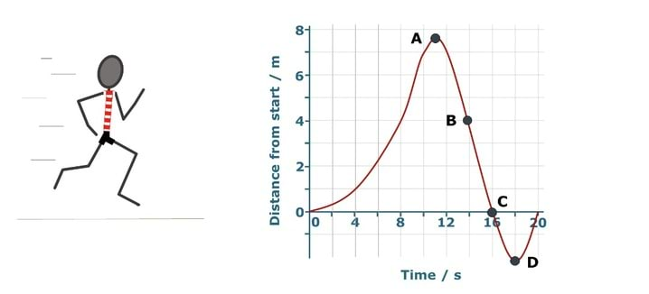
Järgnevad väited kirjeldavad, mida graafik Kadri liikumiste kohta räägib. Märgi igas reas kõige sobivam vastus.
| Punktis A jookseb Kadri kõige kiiremini | |
| Punktis B jookseb Kadri stardi poole. | |
| Punktis C on Kadri peatunud. | |
| Punktis D on Kadri stardijoone taga. |
At A Sally is turning round and is momentarily not moving backwards or forwards. This is shown by the slope of the line which is level at point A. Students often get this wrong because they wrongly link the height of the graph with speed despite the label on the y-axis.
Passing point B Sally’s distance to the start decreases each second. Some students may judge her to be getting further away if they are interpreting the graph as a picture with the x-axis representing distance in a sideways direction.
Incorrect answers at point C are often given because the height is zero, but the slope is not.
Point D is 2m behind the line, shown on the y-axis as a reading of minus two.
If students have misunderstandings about how the graph represents the motion and position of Sally, it can help to discuss what the line on the graph represents along its length with overt reference to the labels on the axes. This can be easily modelled along a demonstration bench.
Another strategy is to use motion sensors and data-loggers to plot real-time graphs of motion. Students can practise predicting the shape of graph for different descriptions of motion and also reproduce the shape of given graphs by moving in front of a motion sensor. The following BEST ‘response activity’ could be used to do this in follow-up to this diagnostic question:
Response activity: Speedy graphs
The effect of real-time laboratory graphing on learning graphic representations of distance and velocity
Brasell, H. (1987). The effect of real-time laboratory graphing on learning graphic representations of distance and velocity. Journal of Research in Science Teaching, 24(4), 385-395.Making Sense of Graphs: Critical Factors Influencing Comprehension and Instructional Implications
Friel, S. N., Curcio, F. R. and Bright, G. W. (2001). Making Sense of Graphs: Critical Factors Influencing Comprehension and Instructional Implications. Journal for Research in Mathematics Education, 32(2), 124-158.
